Contact forms are one of the most important parts of a business website. They act as a direct communication bridge between visitors and your business. However, many WordPress websites lose valuable leads simply because their contact forms are poorly designed, confusing, slow, or unreliable. Businesses often focus on design and content but forget that a single broken or complicated form can stop a potential customer from reaching out.
In today’s competitive online environment, users expect quick, simple, and trustworthy forms. If your WordPress contact form fails to deliver a smooth experience, visitors leave without contacting you. This blog highlights the most common contact form mistakes businesses make and explains how to fix them to increase inquiries, leads, and conversions.
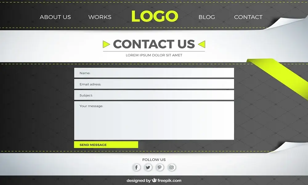
One of the biggest mistakes is adding too many fields in a contact form.
Long forms feel overwhelming and reduce submission rates. Users hesitate when they see unnecessary questions.
A good contact form should ask only what is essential, such as:
Name
Message
The fewer fields you use, the higher your conversion rate will be.
Even a well-designed form won’t perform if users can’t find it easily.
Many websites hide contact forms deep inside pages or place them too far down the page.
Best practices include:
Placing forms above the fold
Adding forms to service pages
Using clear “Contact Us” or “Get a Quote” buttons
Easy access improves engagement and lead generation.
A non-functional form is one of the worst mistakes a business can make.
Common issues include:
Emails not being delivered
Form submission errors
No confirmation message
Spam overwhelming the inbox
Always test your forms regularly and use proper SMTP email setup to ensure reliable delivery.
Generic buttons like “Submit” don’t encourage users to take action.
Your form button should clearly explain what happens next.
Examples of better CTAs include:
“Get a Free Quote”
“Send Message”
“Request a Callback”
A strong CTA increases trust and improves form completion rates.
Most users fill out forms on mobile devices.
If your form fields are too small, misaligned, or hard to type into, users abandon the process.
Mobile-friendly forms should have:
Large input fields
Simple layout
Minimal scrolling
Responsive forms improve user experience and increase submissions.
Visitors hesitate to submit forms if they don’t feel safe.
Missing security indicators reduce trust, especially when personal data is involved.
To build confidence:
Use SSL (HTTPS)
Add a short privacy note
Avoid unnecessary personal questions
Trust signals reassure users and encourage them to submit the form.
WordPress contact forms may seem simple, but small mistakes can have a big impact on lead generation. By simplifying your forms, placing them correctly, ensuring proper functionality, optimizing for mobile, and building trust, you can significantly improve conversions.
A well-designed contact form turns visitors into real opportunities. Fixing these common mistakes ensures your WordPress website works as an effective communication and lead-generation tool for your business.

Greeny is a WordPress agency offering website design, development, SEO, maintenance, and ongoing support services. Founded and managed by experienced WordPress developers, Greeny focuses on building fast, secure, and search-engine-friendly websites with transparency and long-term client support.
GreenyWebs | WordPress Development Agency
Typically replies within minutes
Hello! Need a website that looks great and works perfectly? Chat with us and get started today.
WhatsApp Us
WhatsApp us