In the past, having a simple desktop-friendly website was enough to make your business visible online. But today, things have changed dramatically. With smartphones and tablets dominating internet usage, your visitors are no longer accessing your website from a single screen size or device type. In 2025, more than 65% of all web traffic comes from mobile devices — meaning if your website doesn’t adapt to every screen, you’re already losing potential customers.
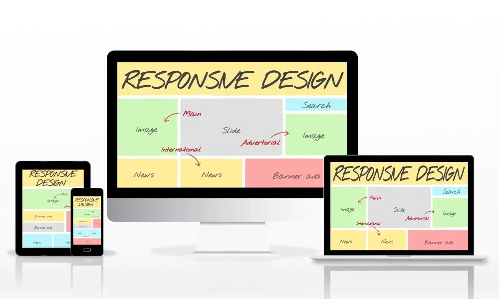
This is where responsive web design comes in. A responsive website automatically adjusts its layout, images, and functionality to fit any screen — whether it’s a large desktop monitor, a tablet, or a small smartphone. It ensures that your visitors enjoy a seamless experience, no matter how they access your site.
For businesses, a responsive website isn’t just about aesthetics — it’s about user experience, brand credibility, SEO performance, and conversions. Let’s explore why it’s become an absolute must-have for every business in 2025.
1. Mobile Usage Is Dominating the Internet
According to recent data, the majority of people browse, shop, and communicate using mobile devices. Whether they’re searching for local services, reading blogs, or making purchases, users expect websites to load perfectly on their phones. If your site doesn’t display properly — with text too small, buttons too close, or layouts broken — visitors will leave within seconds.
A responsive web design ensures your content looks clean and professional on all devices. It automatically adjusts menus, images, and text spacing, providing users with a pleasant browsing experience. And since Google tracks user engagement, a site that keeps visitors longer often ranks higher in search results too.
2. Boosts SEO Performance
Google has officially shifted to mobile-first indexing, which means it primarily ranks websites based on their mobile versions. If your website isn’t responsive or mobile-friendly, you’ll automatically lose visibility in search engines.
Responsive design improves SEO because it eliminates duplicate content issues between mobile and desktop sites. It also ensures faster load times, optimized layouts, and better user engagement — all of which signal to Google that your site provides a high-quality experience.
At Greenywebs, we build fully responsive websites optimized for speed, structure, and SEO — helping your business stay ahead in organic rankings.
3. Improved User Experience (UX)
User experience is one of the most critical factors in online success. Visitors decide within seconds whether they’ll stay or leave your site. If your layout is cluttered, text unreadable, or images misaligned on smaller screens, you’ll lose potential clients instantly.
A responsive design enhances UX by making navigation effortless and content accessible. It ensures that forms, buttons, and images appear correctly on every device. This directly leads to longer session durations, more conversions, and a better overall impression of your brand.
Your website’s design should feel natural — not forced. It should invite visitors to explore, not frustrate them. That’s exactly what responsive web design achieves.
4. Saves Time and Reduces Costs
In the past, businesses often maintained separate versions of their websites — one for desktop and one for mobile. This approach required double the effort, time, and cost for updates, SEO, and design adjustments. Responsive design eliminates that problem completely.
By using a single, adaptive design framework, you can manage your website more efficiently. Any change you make — whether it’s updating a product, changing prices, or posting a blog — automatically appears correctly across all devices.
This unified approach not only saves money but also keeps your brand consistent everywhere.
5. Enhances Conversion Rates
A beautiful website means nothing if it doesn’t convert visitors into customers. Responsive design directly impacts conversion rates by ensuring that your visitors have a smooth path from browsing to taking action.
Imagine a potential customer trying to fill out your contact form or make a purchase on their phone — but the buttons are too small or the form fields overlap. Chances are, they’ll give up. A responsive design prevents this by ensuring all interactive elements are mobile-friendly and easy to use.
Better usability = better conversions. It’s as simple as that.
Conclusion
In 2025 and beyond, responsive web design isn’t just a web development trend — it’s the standard. It impacts everything from SEO and user experience to lead generation and brand reputation. Whether you’re launching a new website or revamping an old one, making it responsive should be your top priority.
At Greenywebs, we specialize in building modern, responsive, and high-performing WordPress websites that look stunning and work flawlessly across all devices. If your current site doesn’t meet these standards, now is the perfect time to upgrade and give your visitors the experience they deserve.